CoGo is a mobile application supporting environmentally friendly businesses.
Company
CoGo is an ethical and sustainable fintech launched in Dec 2018 that allows you to support companies that match your values. The platform is designed to be ethical and sustainable and aims to help consumers make better decisions about where they spend their money.
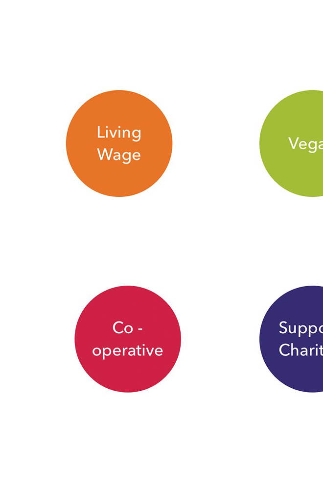
Supporting values
When you shop with CoGo-verified businesses, you earn CoGo points for each purchase. These points can then be redeemed for rewards such as free products or discounts. The more often you shop with verified businesses, the higher your CoGo score will be.
CoGo's mission is to provide a platform where customers can support companies who align with their values, while also rewarding those businesses with increased visibility through their accreditation badges.
How it works
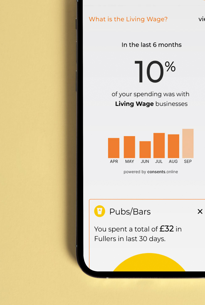
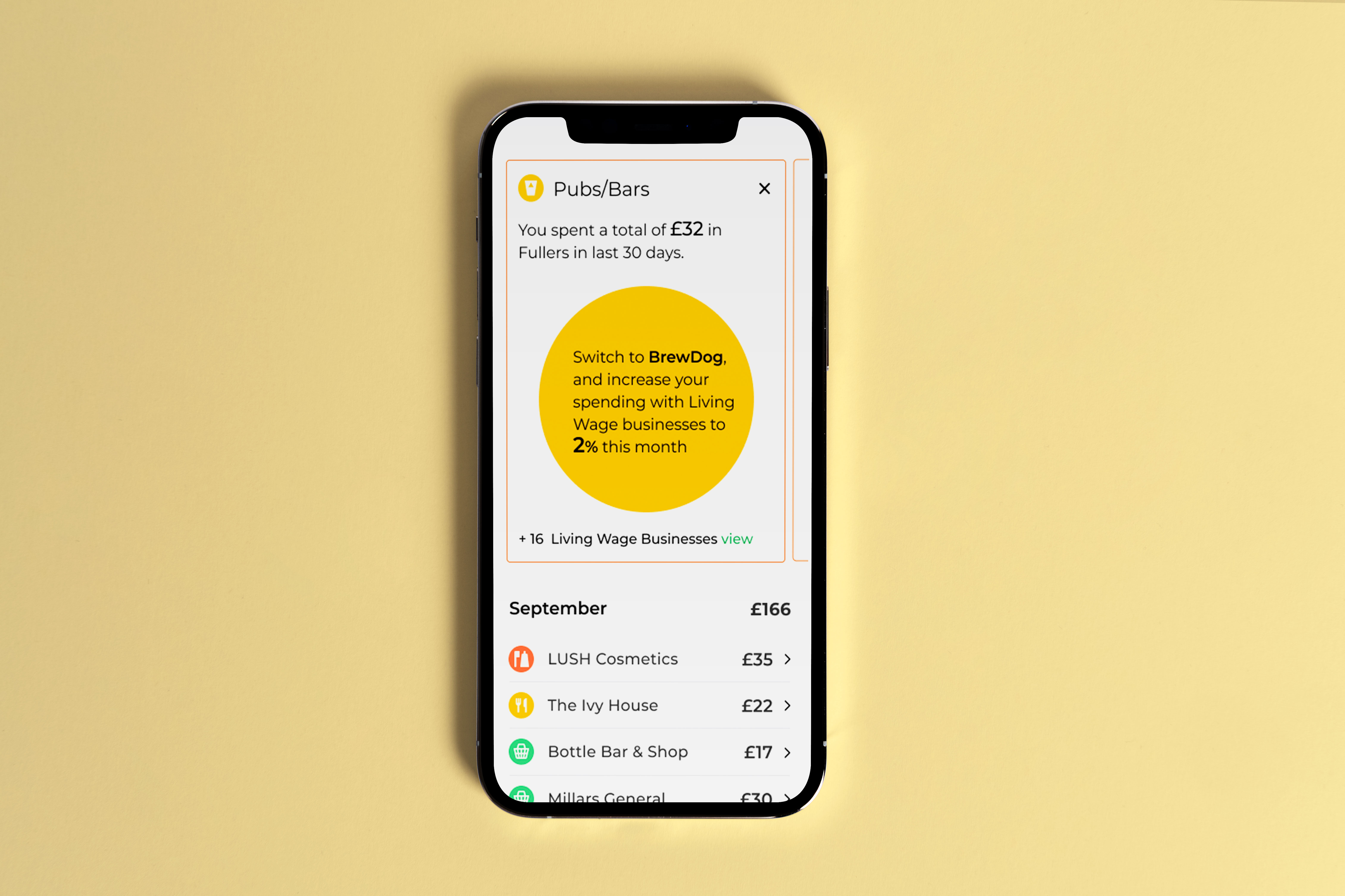
The engine displays previous spending choices and recommends alternative businesses supporting your values. The calculation is based on transactions occurring within 30 days from the date of the purchase.
You can choose to filter results by category, location, or business name. You will also be prompted to select your values (choose up to 3), which will help improve the accuracy of future recommendations.
The Challenge
To coincide with the Living Wage week, our team was under extreme pressure to move fast. We were tasked to deliver the redesign of the Living Wage wallet within 5 weeks. This included working on user testing, user feedback, wireframes, final UI and detailed functional specifications.
The combination of a fixed, tight deadline, App Store submission time, security, bug and usability testing meant I needed to hit the ground running and get the experience right in the first couple of weeks.
One of the main issues we faced was the app had failed to effectively communicate the benefits of CoGo and as such a high number of users were not fully engaging with the app. I had to rapidly discover ways to improve engagement and increase retention rates.
Beta 1 Research
I believe that having a clear understanding of user goals from my research was key, as I were able to consider not only what the app should do, but also how it should feel, while also supporting user goals. I believed this would be the difference between delivering a good experience and an excellent one.
When you're designing a product that people interact with on a daily basis—whether it's an app or website—you want everything about it to be easy and intuitive. In order to create something that people can use without getting frustrated or confused, you need to know exactly what they want from your product.
Areas for improvement
As a user experience designer, one of my biggest responsibilities is to ensure that the app is meeting our users' needs and expectations. This means understanding what they want out of the app and how they want to use it, then designing features that make those things happen.
I started by looking at problem areas with the existing app features and thinking of ways to improve them while also increasing user retention rates. I discovered that our onboarding process was one of the biggest problems we were having. Many users downloaded the app but didn't sign up, so we weren't getting as much use from it as we could have been.
To address this issue, I looked at what other apps were doing well in terms of onboarding and engagement. I also talked to our users who use the app regularly to find out what they liked and disliked about it so far. This helped me create an actionable plan for improving user experience with our onboarding process and also ensure we are building an app that meets their needs and expectations as best as possible.
The first thing I did was focus on making the onboarding process more user-friendly and intuitive. made it easier for users to find their way around the app, especially after they had signed up, so they could get started using it quickly. I also looked at how we could make the app easier for new users to understand how it worked. For example, we added more 'helpful tips' throughout the app that would guide them through its features in a clear way.
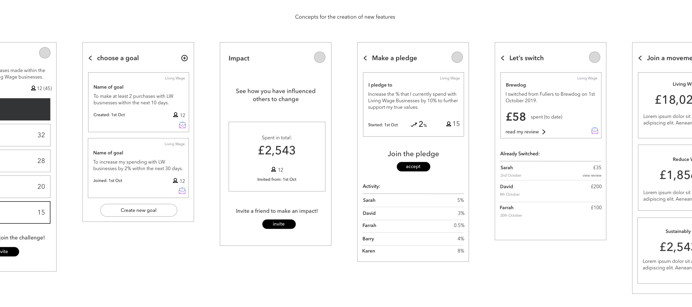
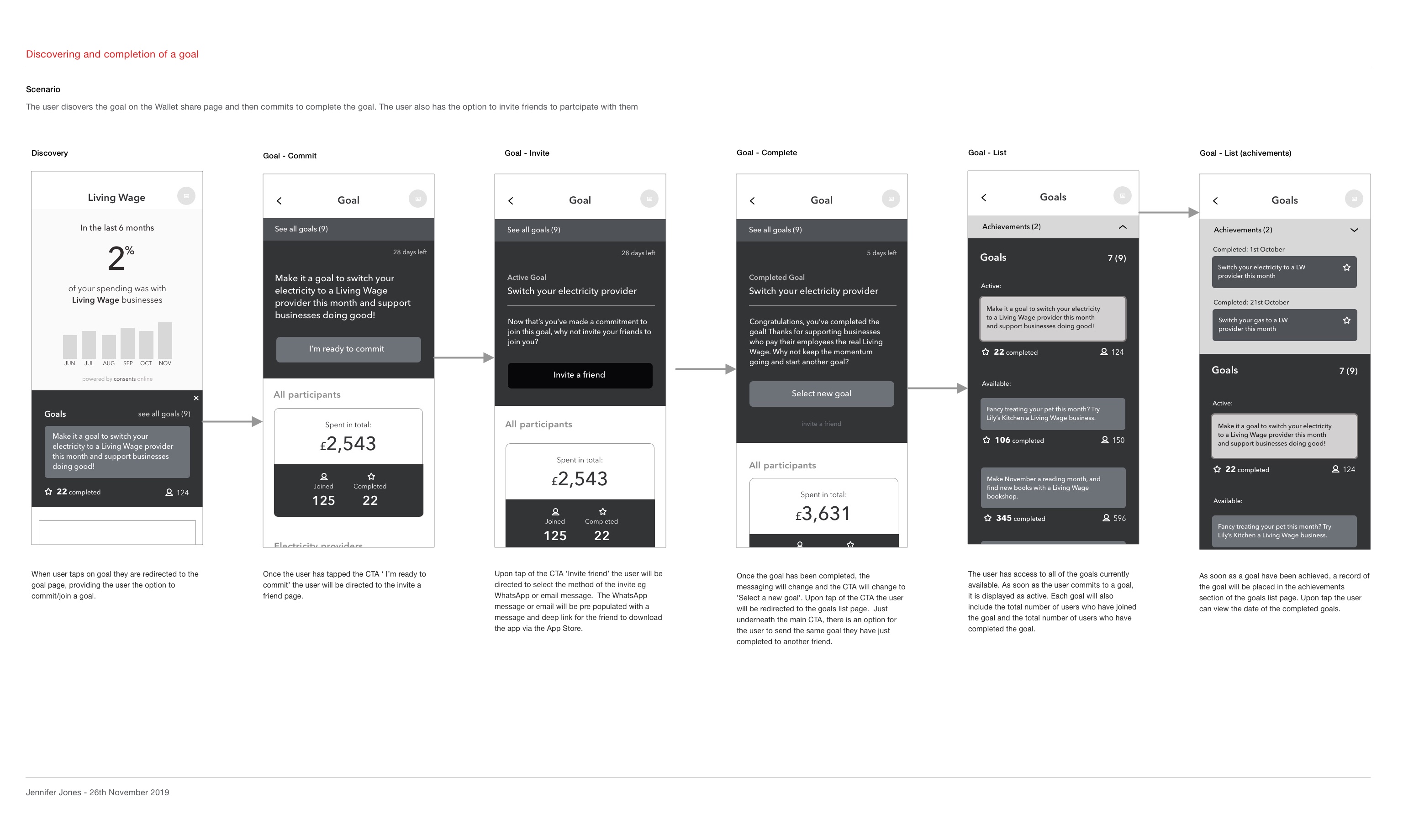
Working on new features
The process of adding new features began with ideation workshops. I collaborated with my product manager, product owner and main stakeholders to help evangelize ideas, gain alignment, and define the value proposition. I further defined these ideas with the product owner before creating prototypes to test our hypothesis. Once each idea was designed and approved, I began to organise one-on-one user testing sessions.
Usability Testing
I conducted a range of interviews with users who had expressed an interest in participating in user testing sessions. These interviews provided valuable insights into the needs of our users and gave us greater insight into our hypothesis.
I worked closely with the team to help define tasks, and establish objectives for user testing sessions. To ensure the test was realistic, I created InVision prototypes and uploaded it to Lookback. Lookback is great for conducting one on one testing sessions. As a result of the testing sessions, we were able to find usability issues related to perceived affordances, layout and search.
Focus groups
Based on the results of the earlier user testing, I ran a focus group with 4 users who had previous experience using the app. They were shown a prototype version created with Invision to mimic the real experience of using the app on their phone. Several questions were asked including about the user interface, setting up, tracking and sharing goals with either friends or other users of the app. The results were collated and presented in a report which was shared with the stakeholders and also used to inform design decisions.
Customer mapping
I created a customer mapping document to show the various states of the user's journey and how we could improve their experience. This included what emotional state they were in, what point on the sales funnel they were at and which department was responsible for creating that experience. With this, we could make better decisions about what to focus on.